
Notes on Color: Persimmon
NOTES
ON
COLOR


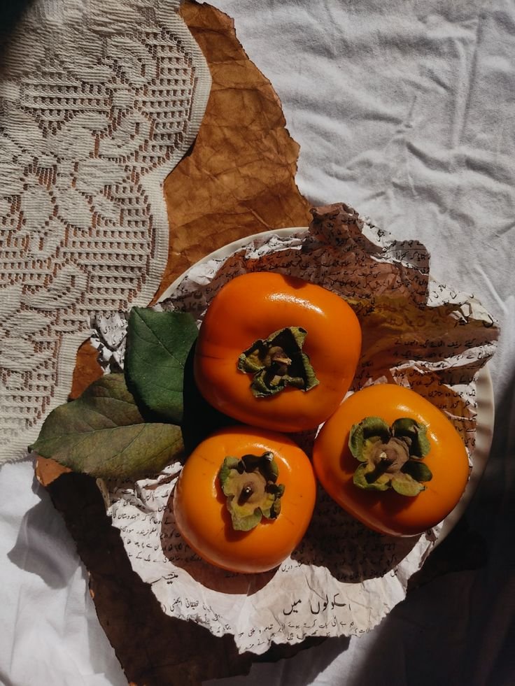
Photo credits, left to right: Ralph Lauren Spring 2015, Unknown via Pinterest
Persimmon (both the color and the fruit!) is a beautiful symbol of the changing seasons. As a transitional color it can act as a bridge between the brighter colors of summer and the earthier tones of fall. It is bold and impactful while being classic at the same time - think iconic Hermès boxes that brand devotees put on display in their homes.
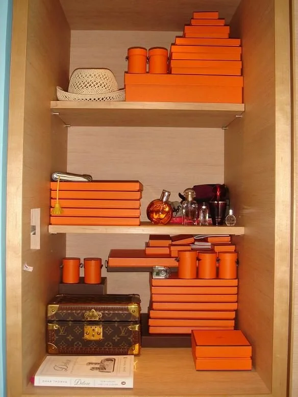
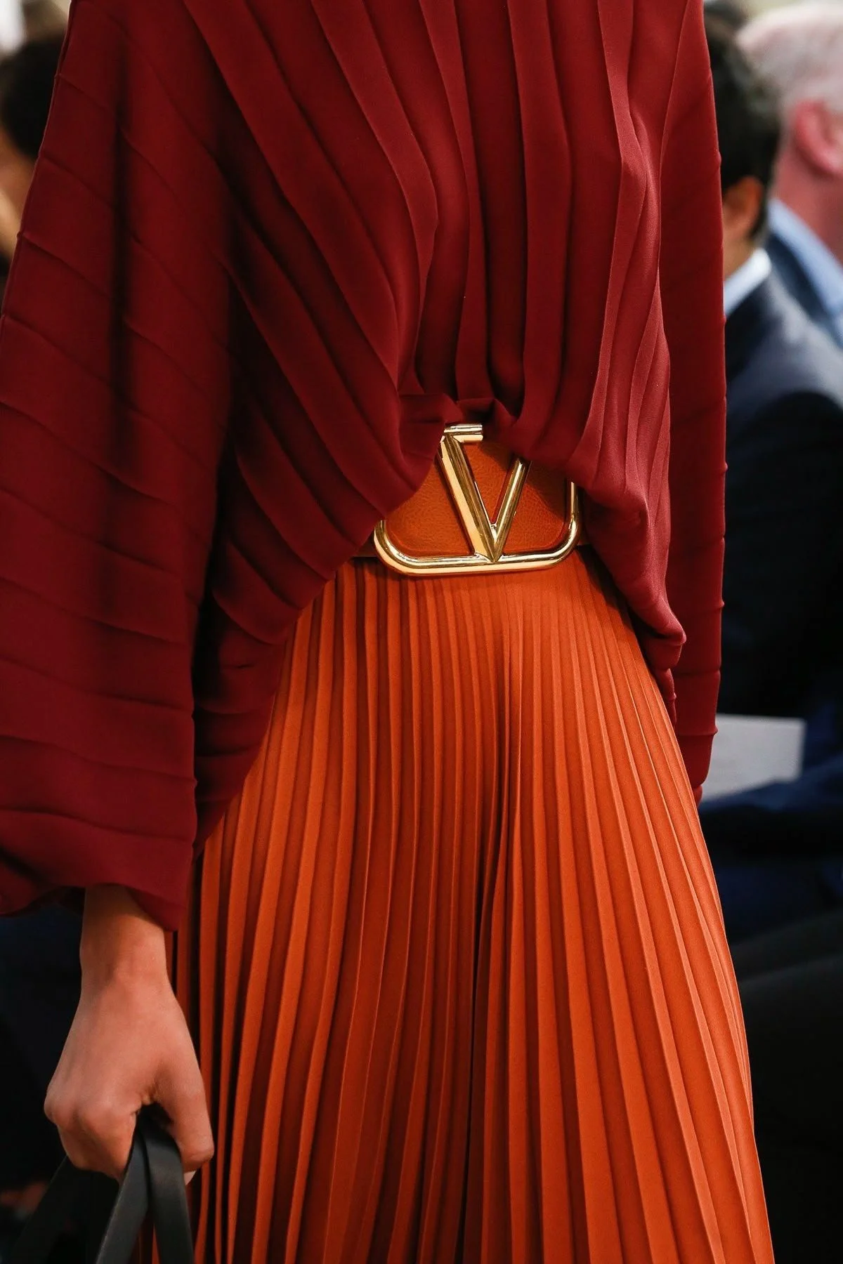
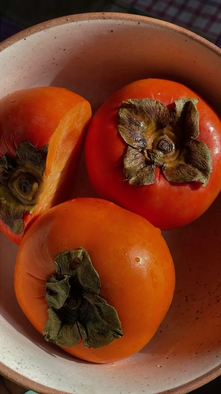
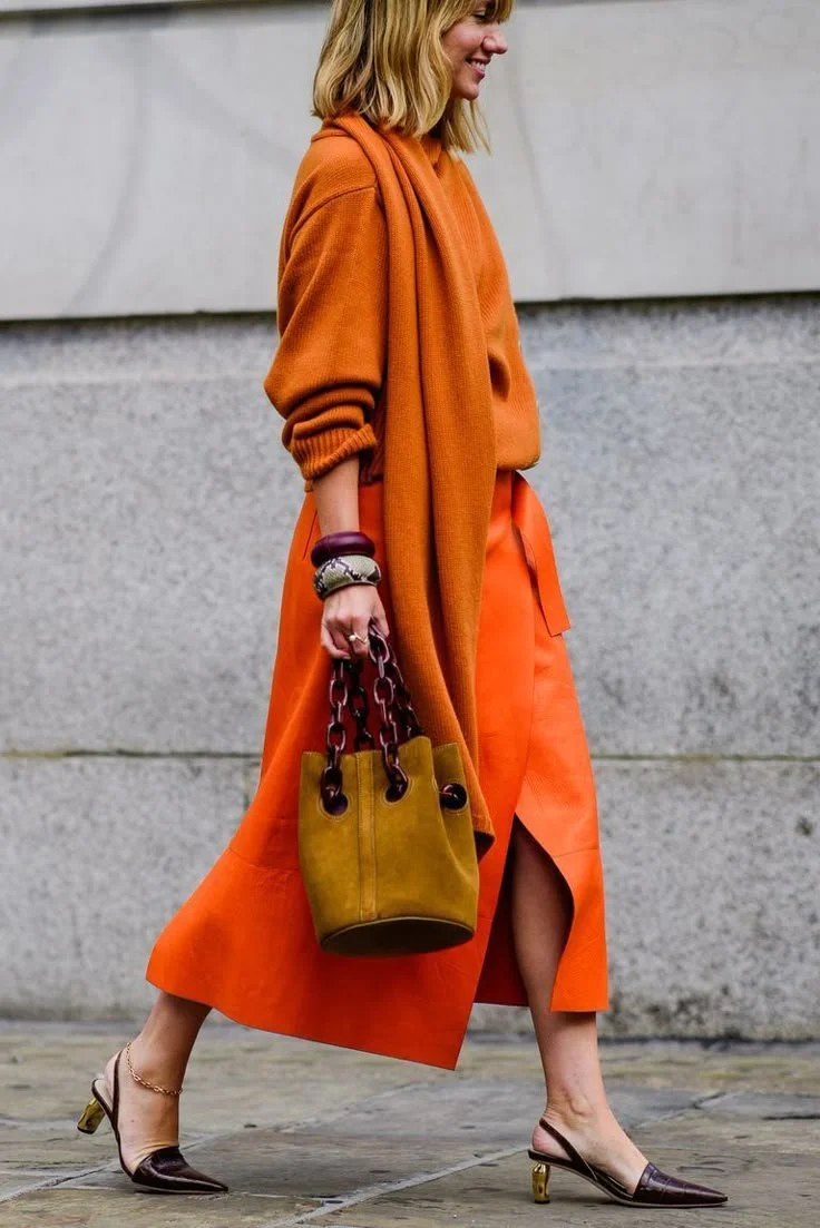


Photo credits, clockwise from top left: Hermes boxes, Valentino, Unknown via Pinterest, Unknown via Pinterest, Unknown via Pinterest, Hermes boxes
Persimmon in Interiors
We would love to see persimmon used in a home in a bold way via kitchen cabinetry, a sofa, rug, or even as a common thread throughout the rooms of a house. It would be absolutely epic as a statement range in a kitchen in wine country, an exclamation point for your kitchen and something none of your neighbors will have. Persimmon would be beautiful paired with a creamy white, super dark chocolate brown, or a slate blue.
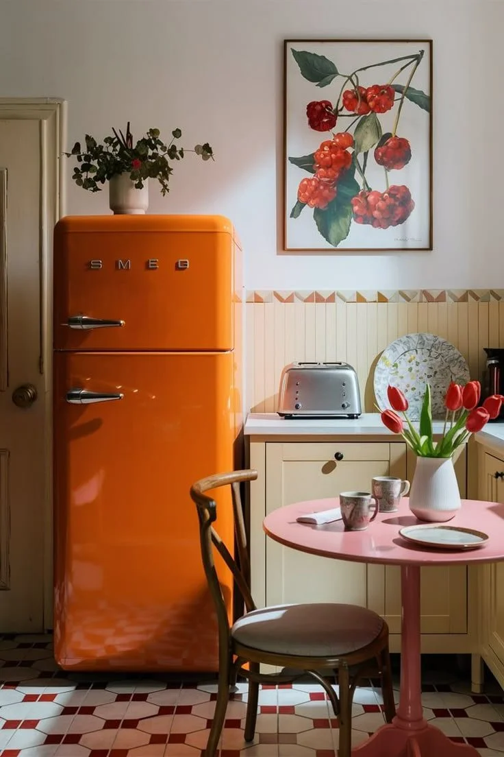
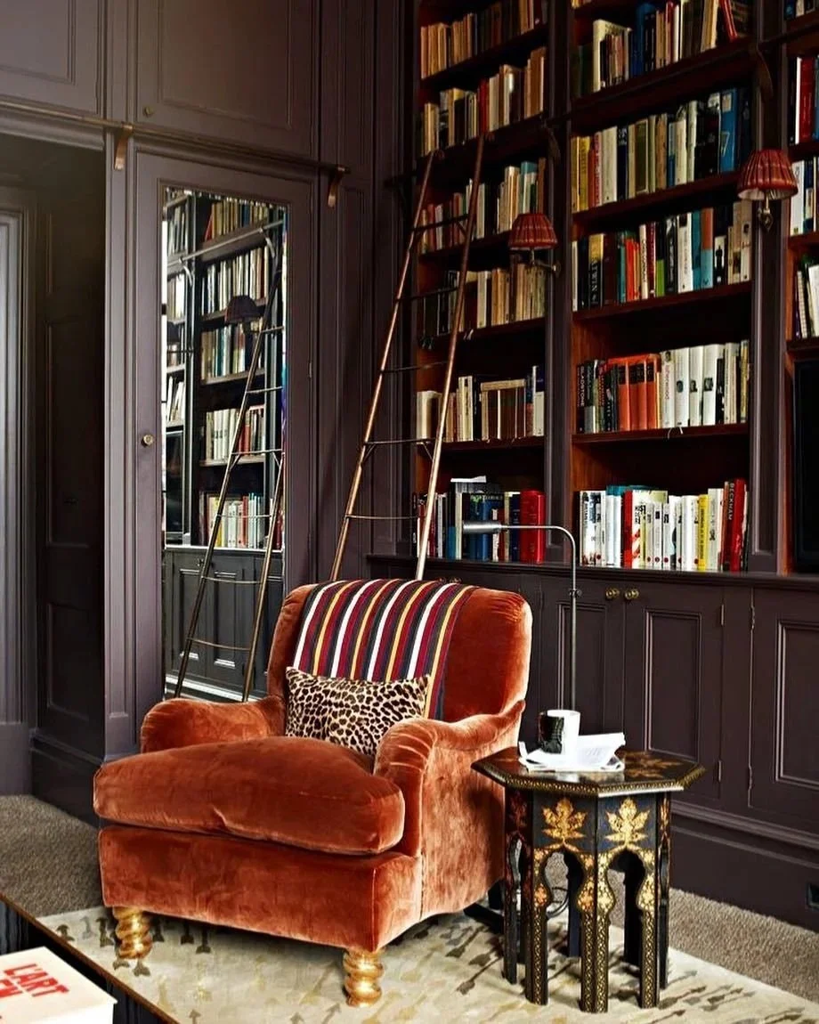
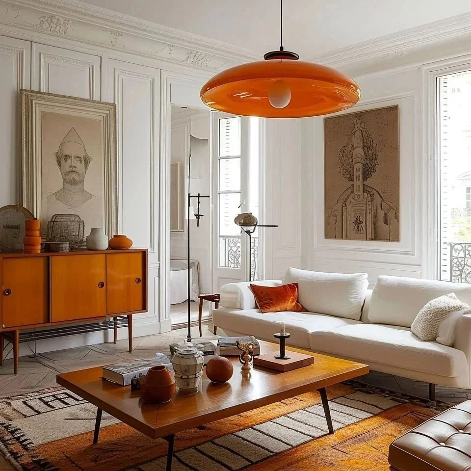
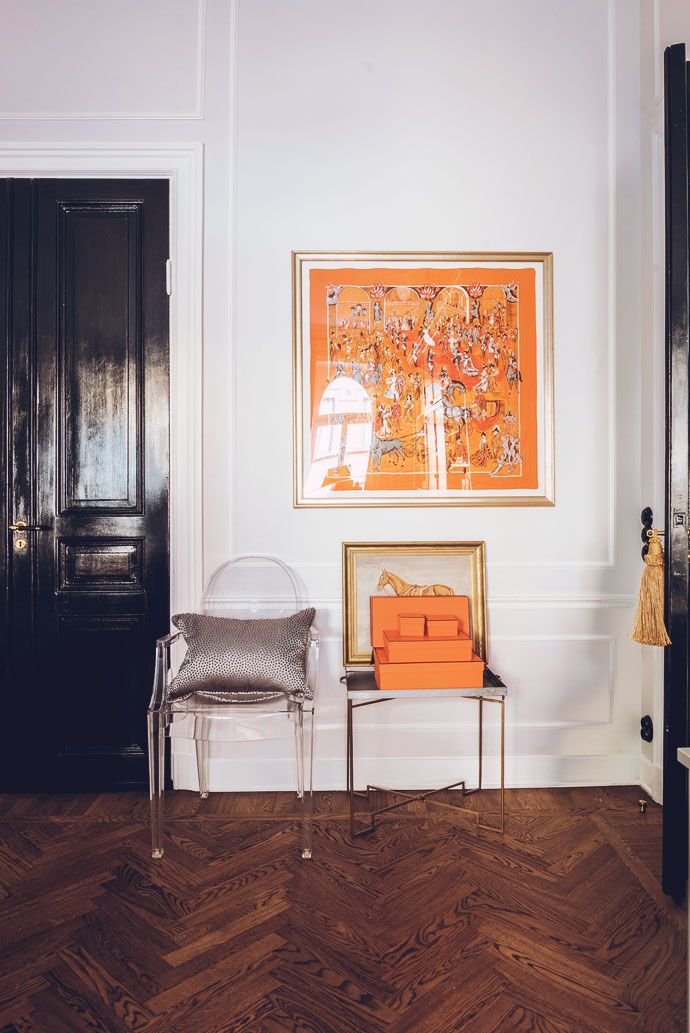
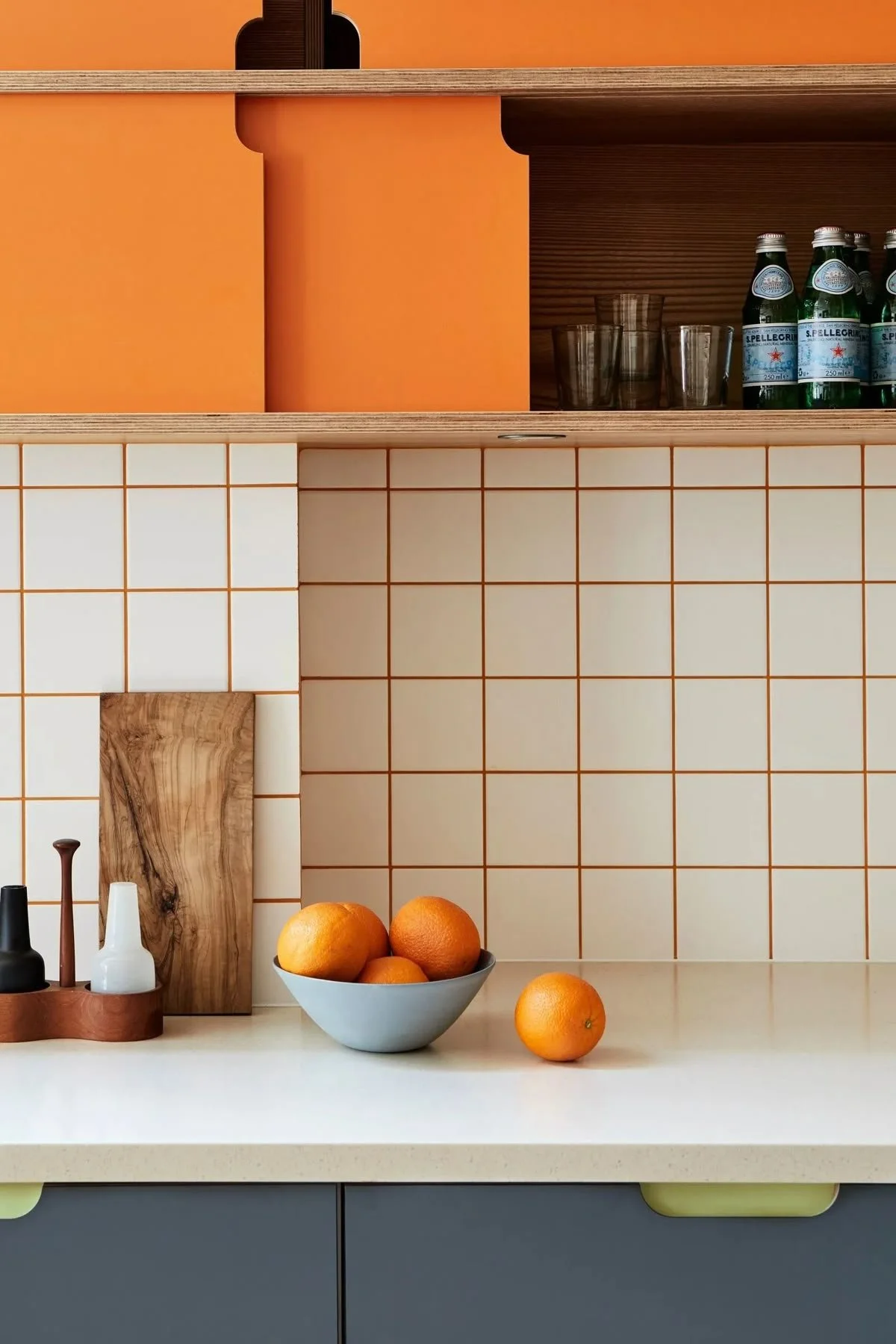
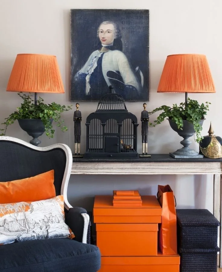
Photo credits, clockwise from top left: Unknown via Pinterest, Douglas Mackie, Unknown via Pinterest, Kathryn & Robbie Collin, Unknown via Pinterest