
Notes on Color: Cobalt
NOTES
ON
COLOR
Cobalt is such a good color for the peak summer season. It reminds us of the Greek islands as much as it does the deep cobalt of Lake Tahoe’s waters, and everyone seems to be wearing the color during hot summer days! Cobalt is festive and joyful and well suited for interior applications too.

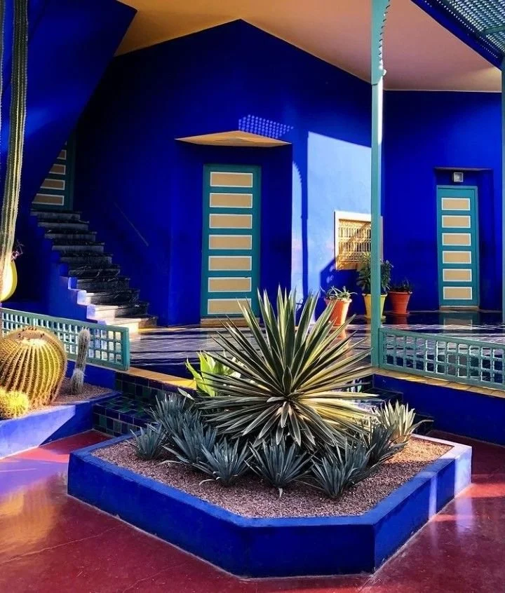
Photo credits (left to right): unknown via Pinterest, Jardin Majorelle in Marrakech, Morocco
Cobalt in Interiors
In an interior cobalt can lean rich blue or go more into a bright pop of color moment. Both ways it can pull nuanced referenced from the natural landscape into a home, which we love. We would pair it with warmer wood tones, terracotta, camel, citrine, or butter yellow. It would be fantastic in a hot, tropical landscape!
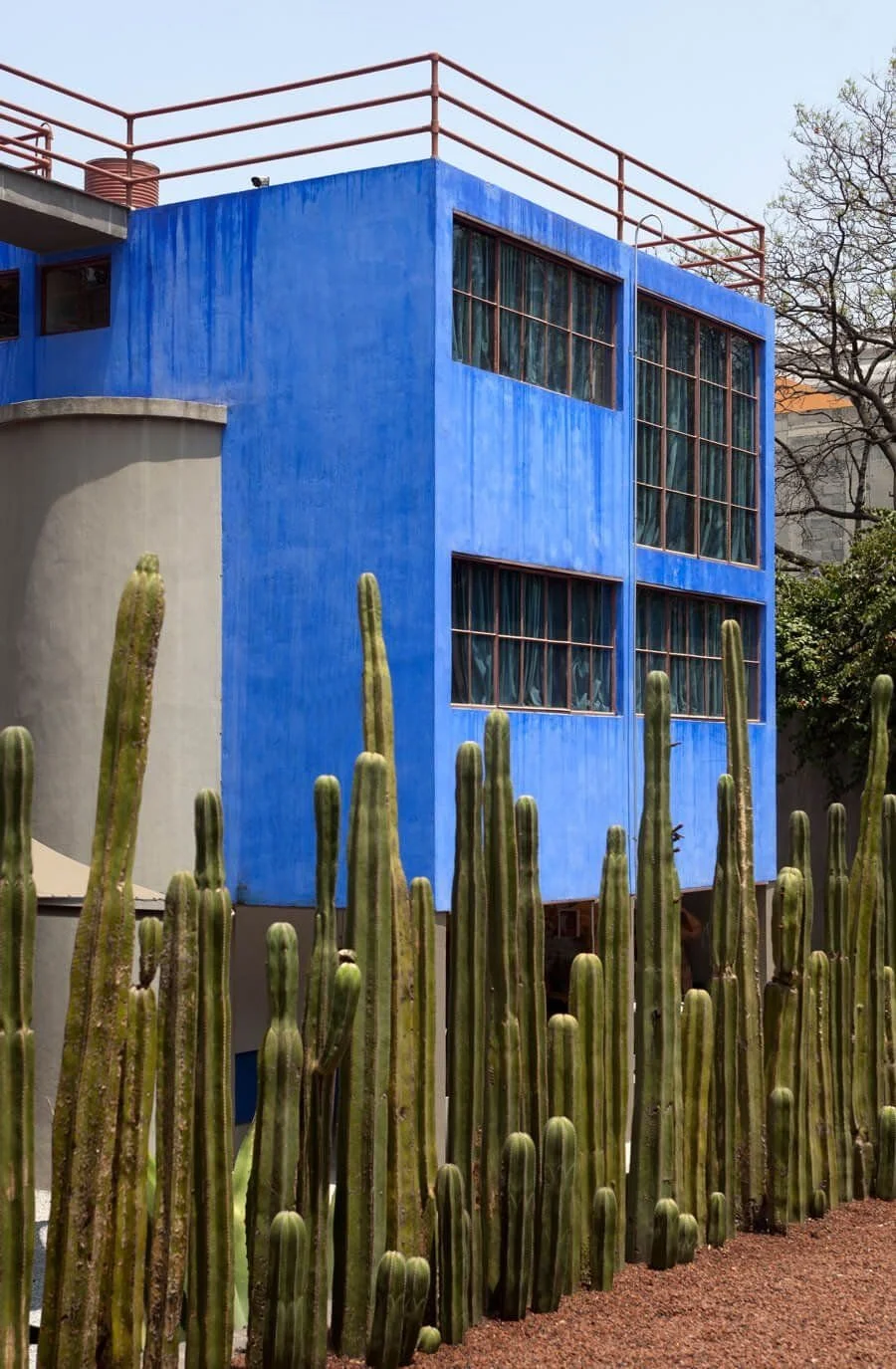
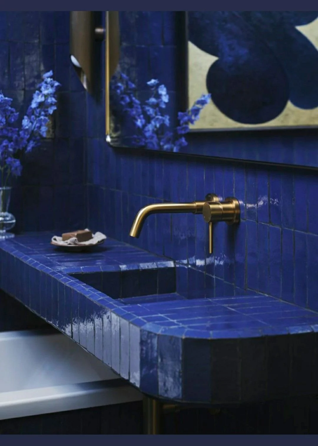
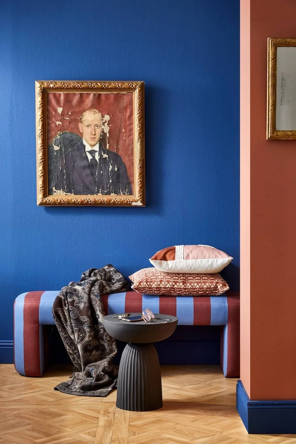
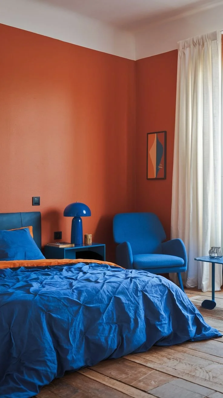
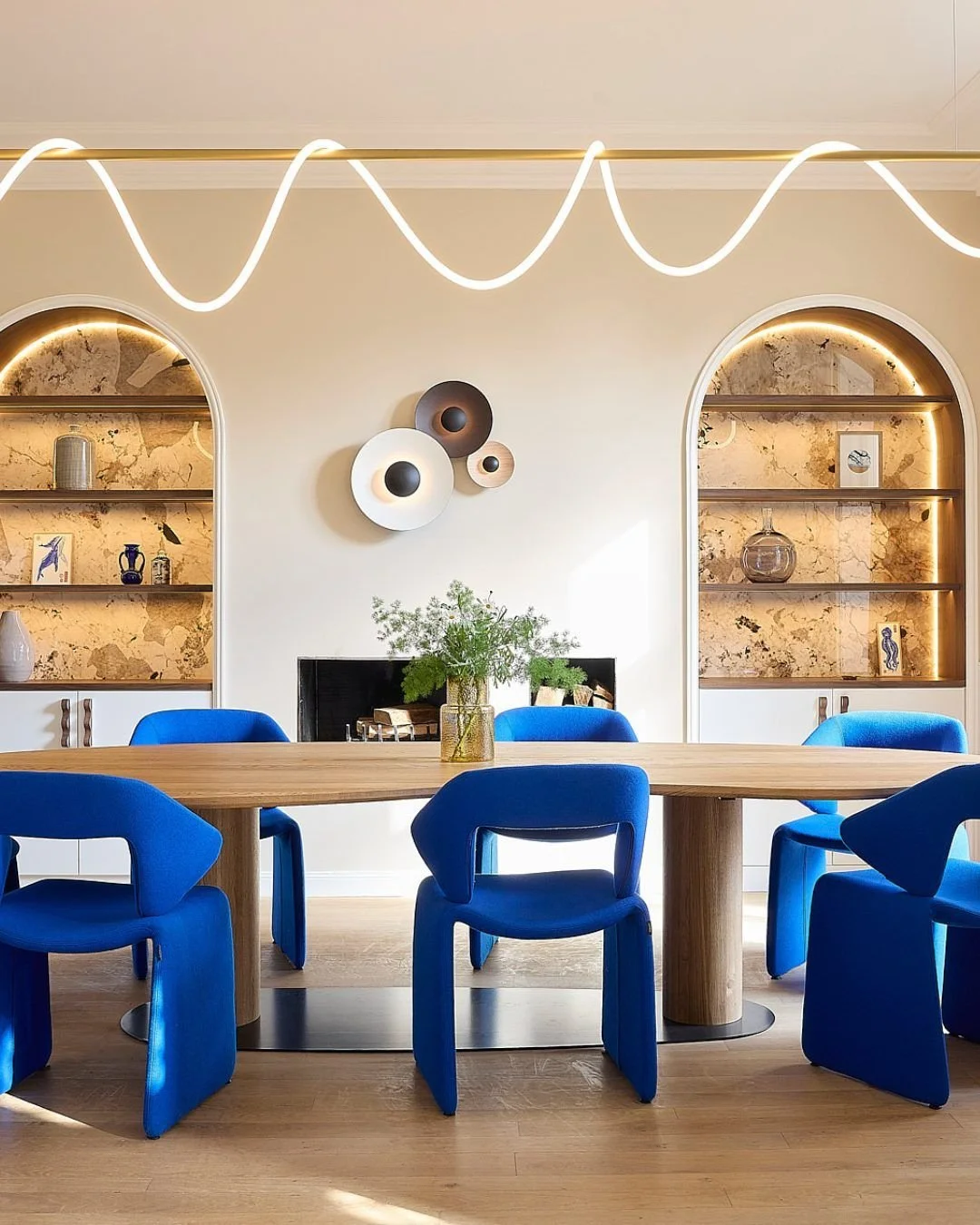
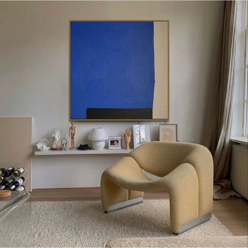
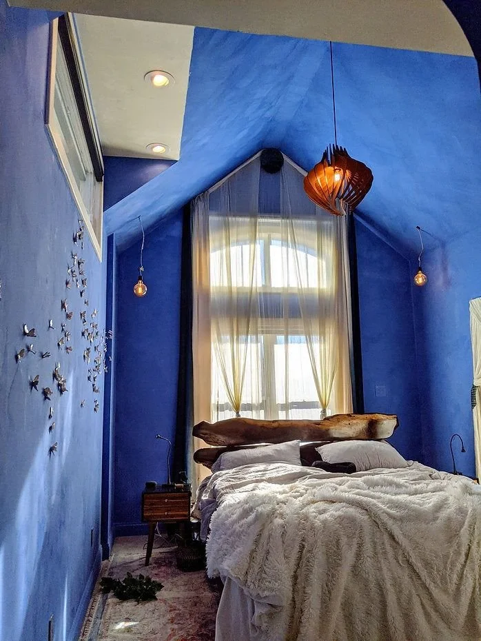
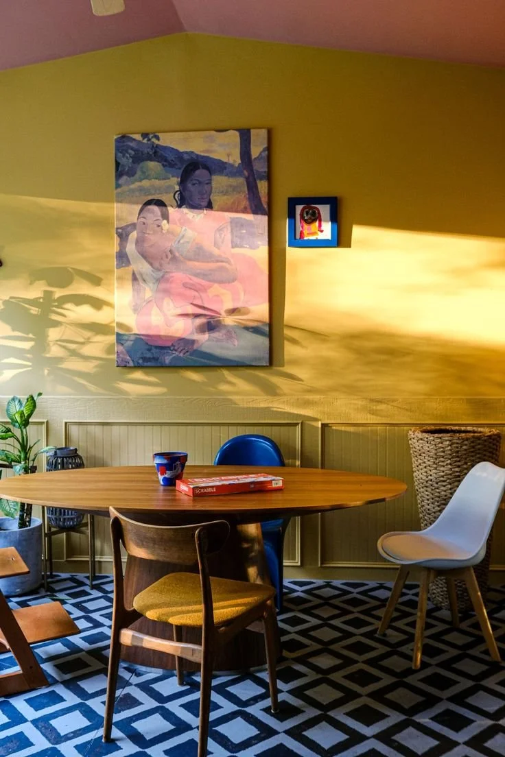
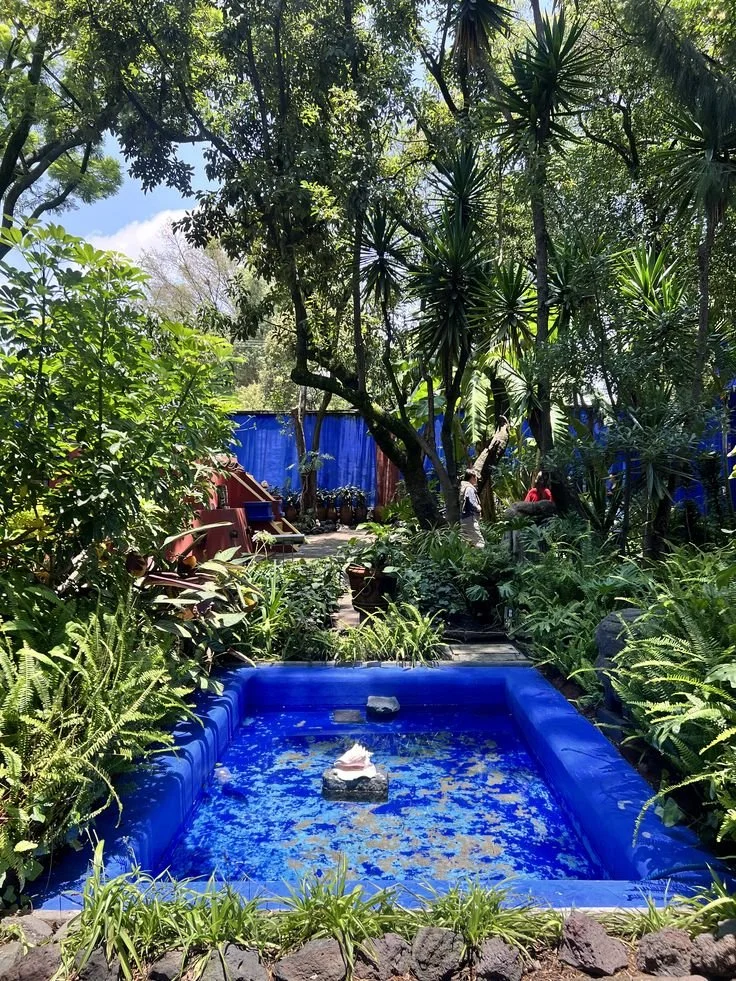
Photo credits, clockwise from top left: Frida Kahlo's Casa Azul in Mexico City, unknown via Pinterest, unknown via Pinterest, unknown via Pinterest, Maison Sama, unknown via Pinterest, Color Atelier, Stacey-Ann Blake, Frida Kahlo's Casa Azul in Mexico City
Color-drenched Speakeasy
We took inspiration from Tahoe’s blue waters when we designed a Speakeasy for a client last year. We color drenched the jewel box of a space from top to bottom in a gorgeous deep cobalt. Everything is blue from the moire draperies from Dedar to the custom cabinetry and velvet banquette, and the effect is almost like a chic underwater cocktail bar!
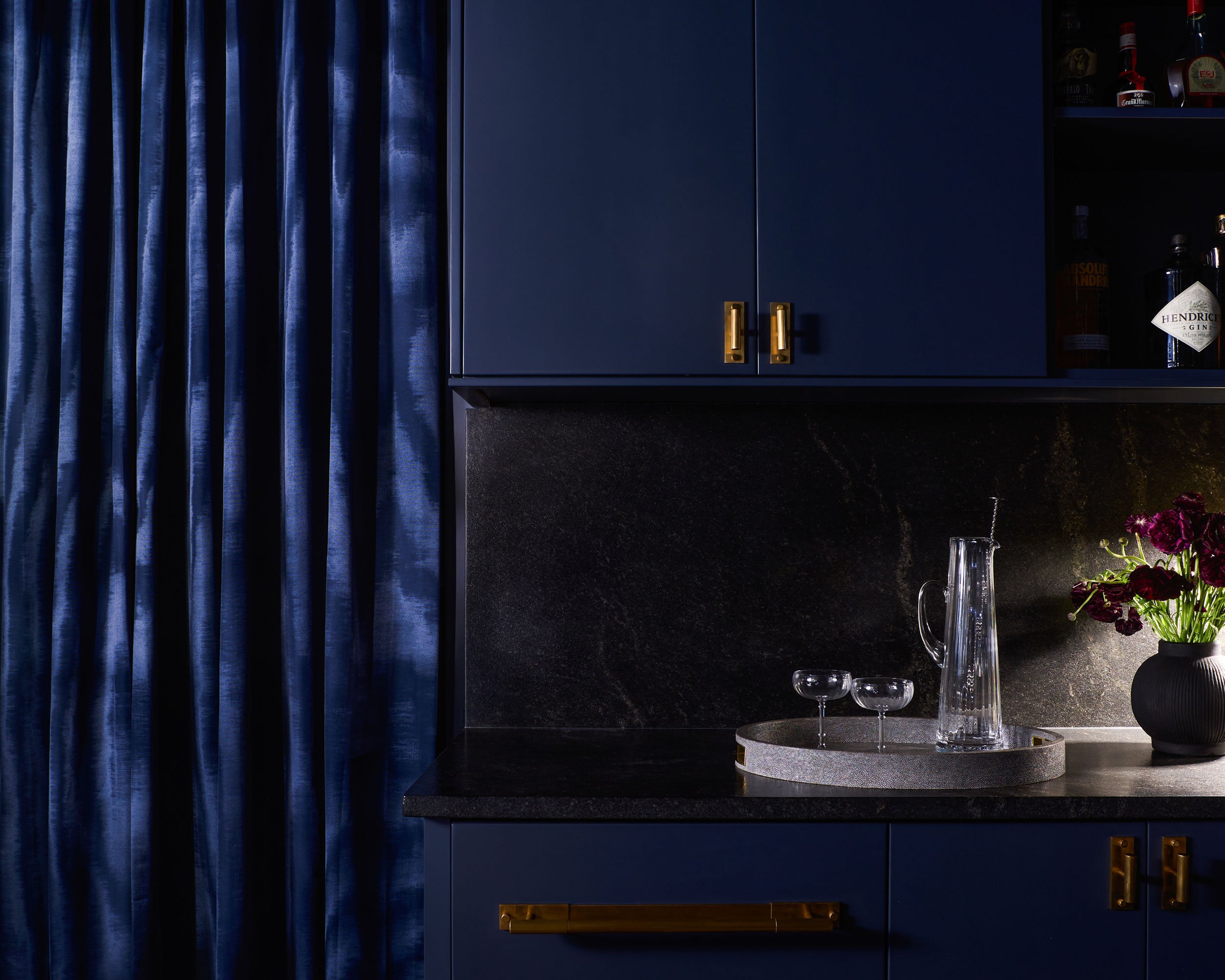
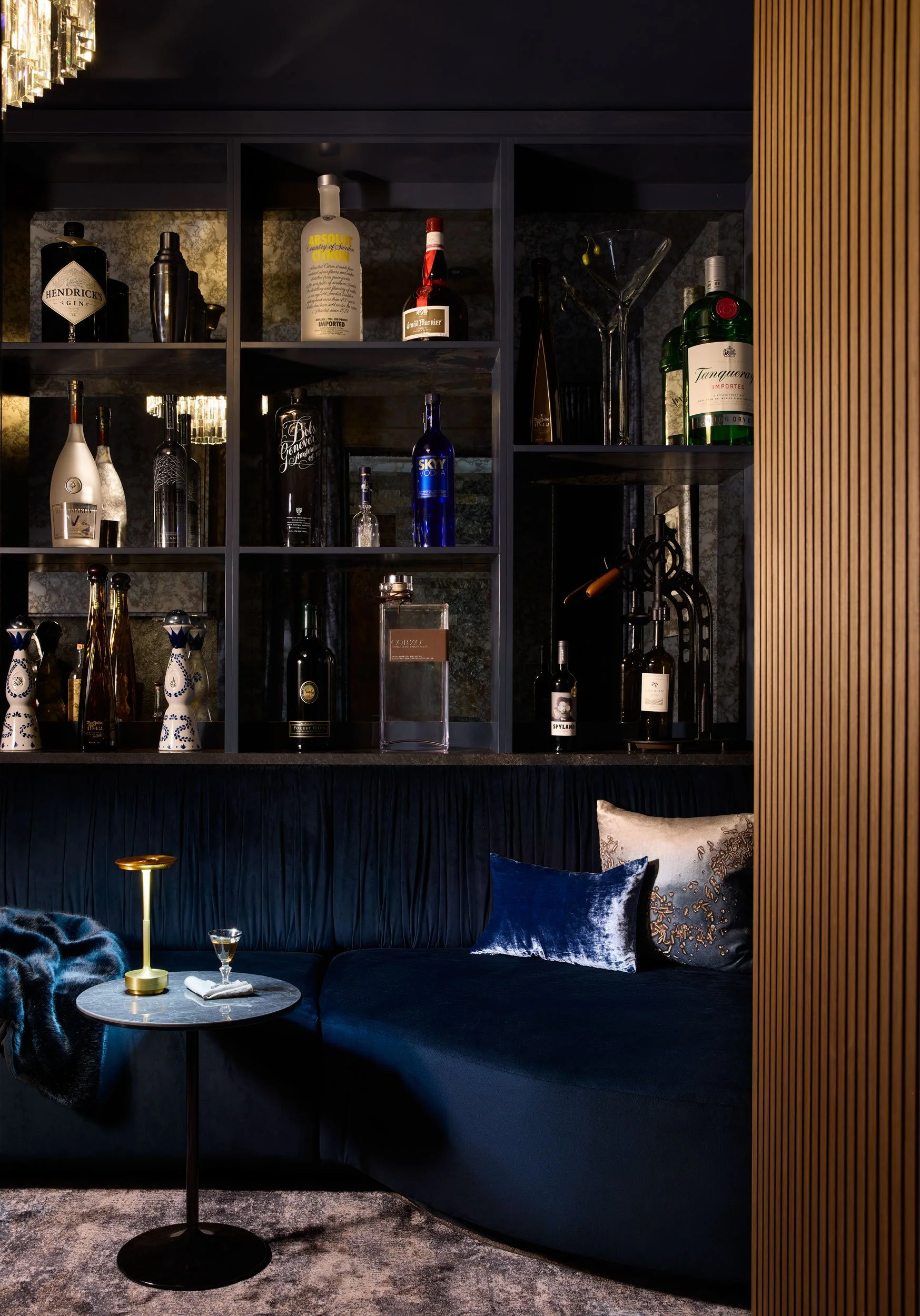
Photo credits: Suzanna Scott