

NOTES
ON
COLOR


Photo credits: x
October's color of the month is SLATE BLUE! Slate blue can be a beautiful neutral, but it is so much more interesting than a plain grey. It has a lot more depth and character, and references bodies of water. It is tailored without being stuffy. Perfect for homes in the Bay Area, Lake Tahoe, or other homes in proximity to water 💙
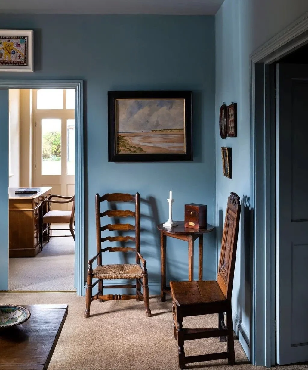
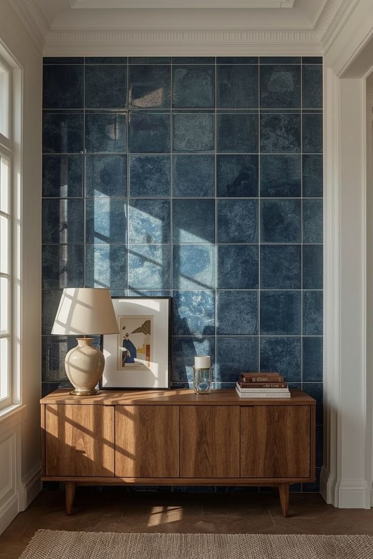
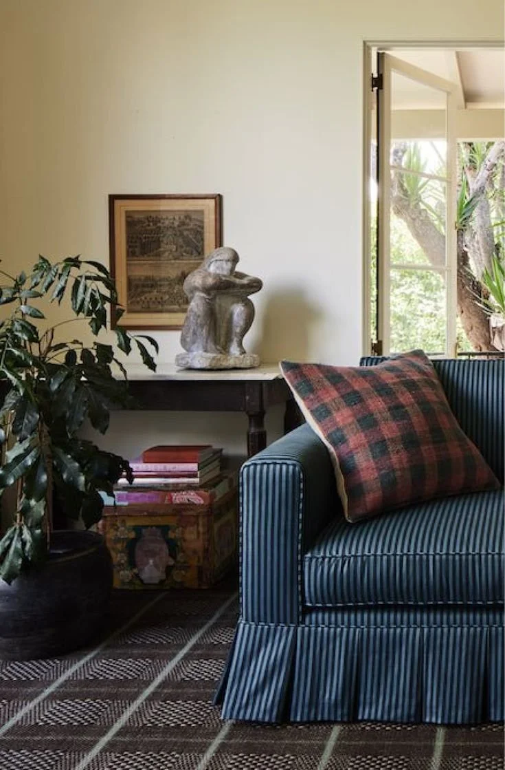
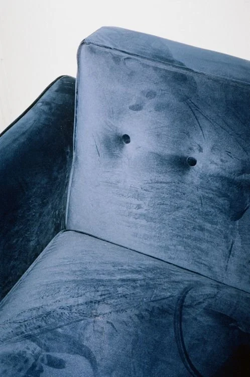
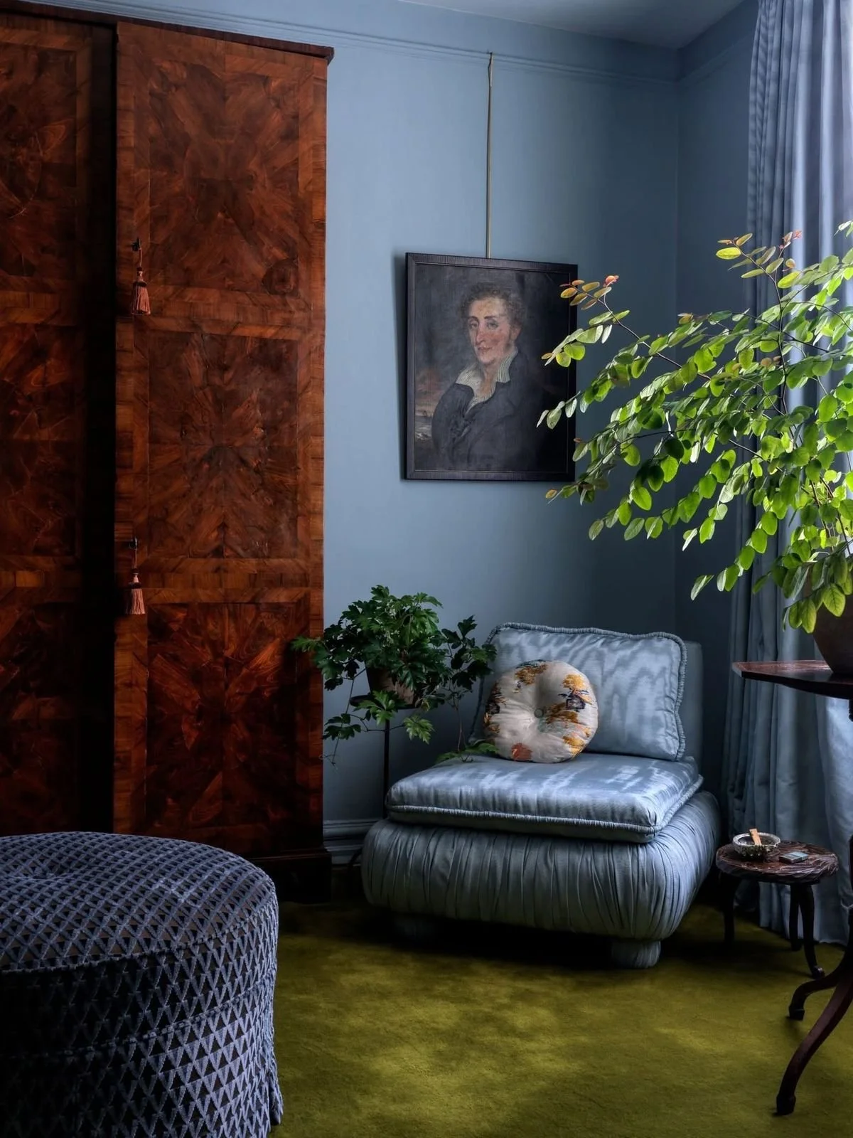
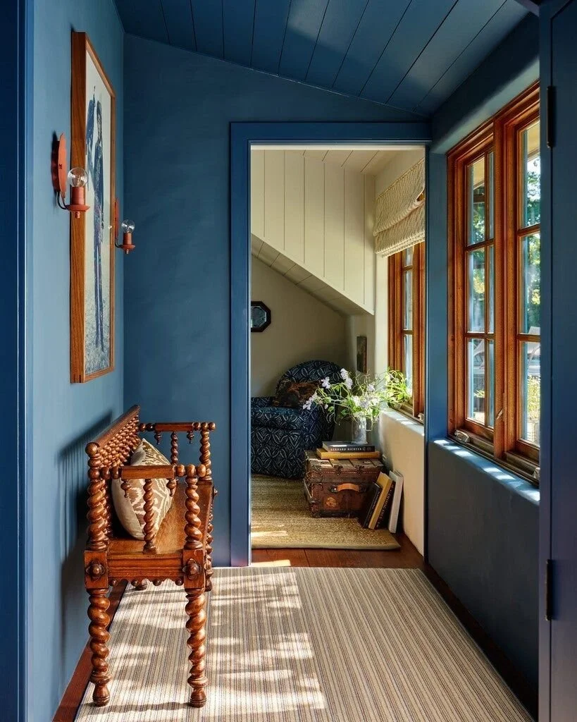
Photo credits, clockwise from top left: Farrow & Ball, Unknown via Pinterest, Nickey Kehoe, John Ferguson Interiors, Tony Liu, Unknown via Pinterest
Slate Blue in Bridget Giroux Design Interiors
Our work has a lot of organic, natural elements, and slate blue adds a beautiful juxtaposition to those elements with sophistication and elegance. It works in so many different contexts and looks great on everyone. In our Logan Creek Hideaway project, we designed the kitchen with a wall entirely clad in glossy slate blue tile. The tile beautifully reflected the light, and glistened like the surface of Lake Tahoe (right outside!)
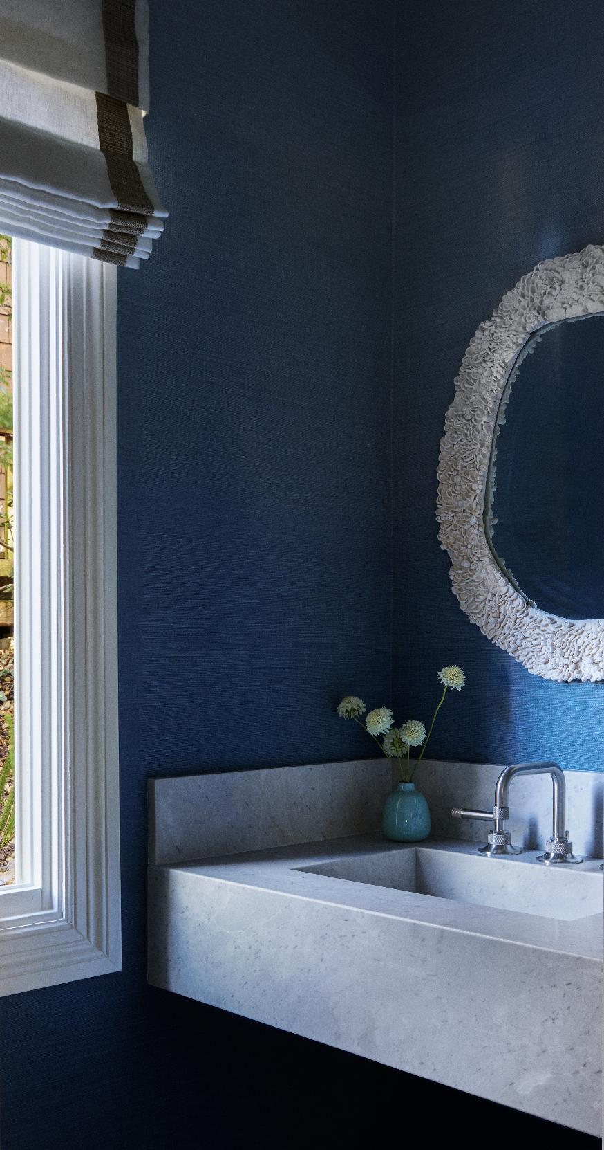
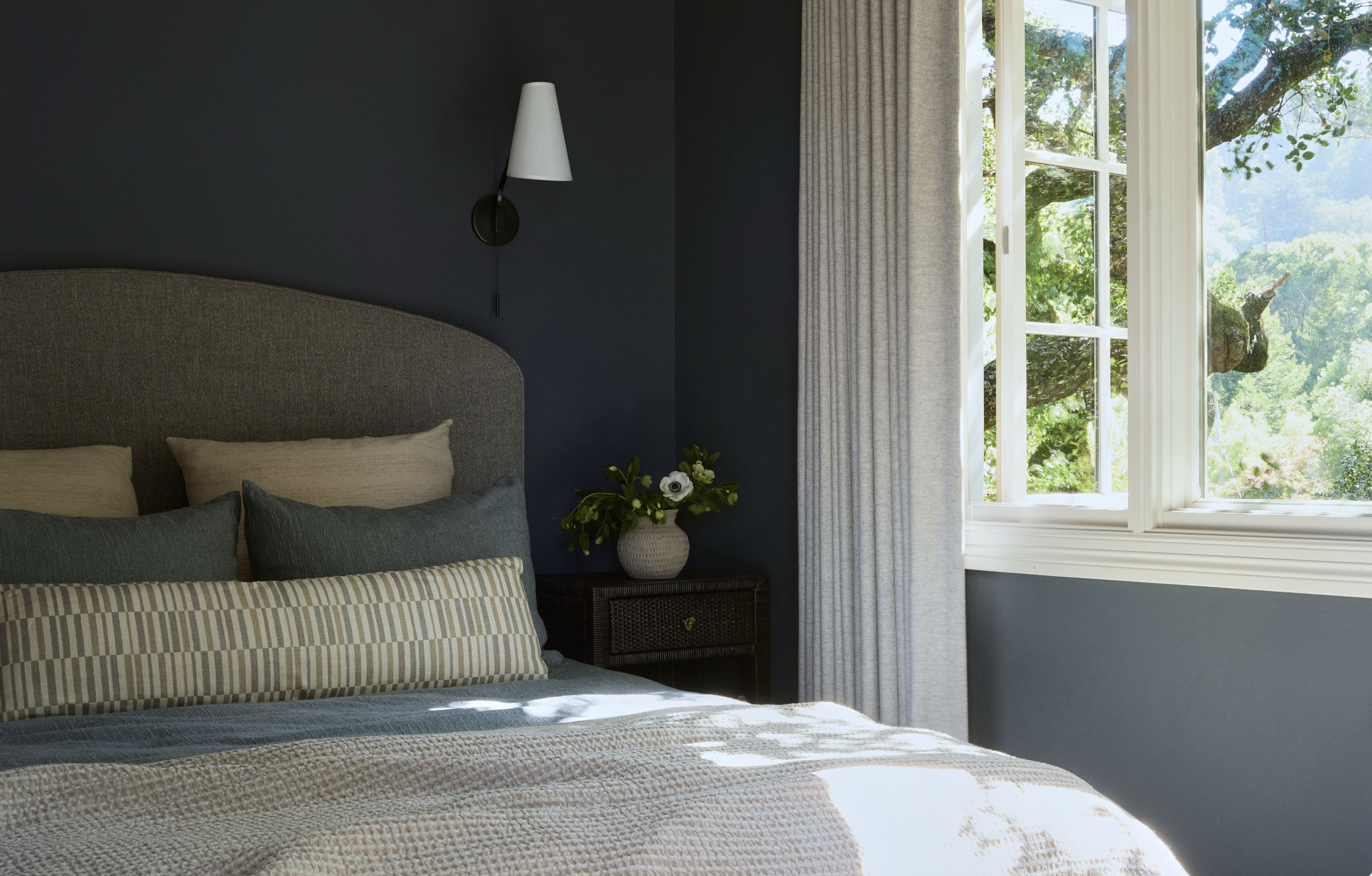
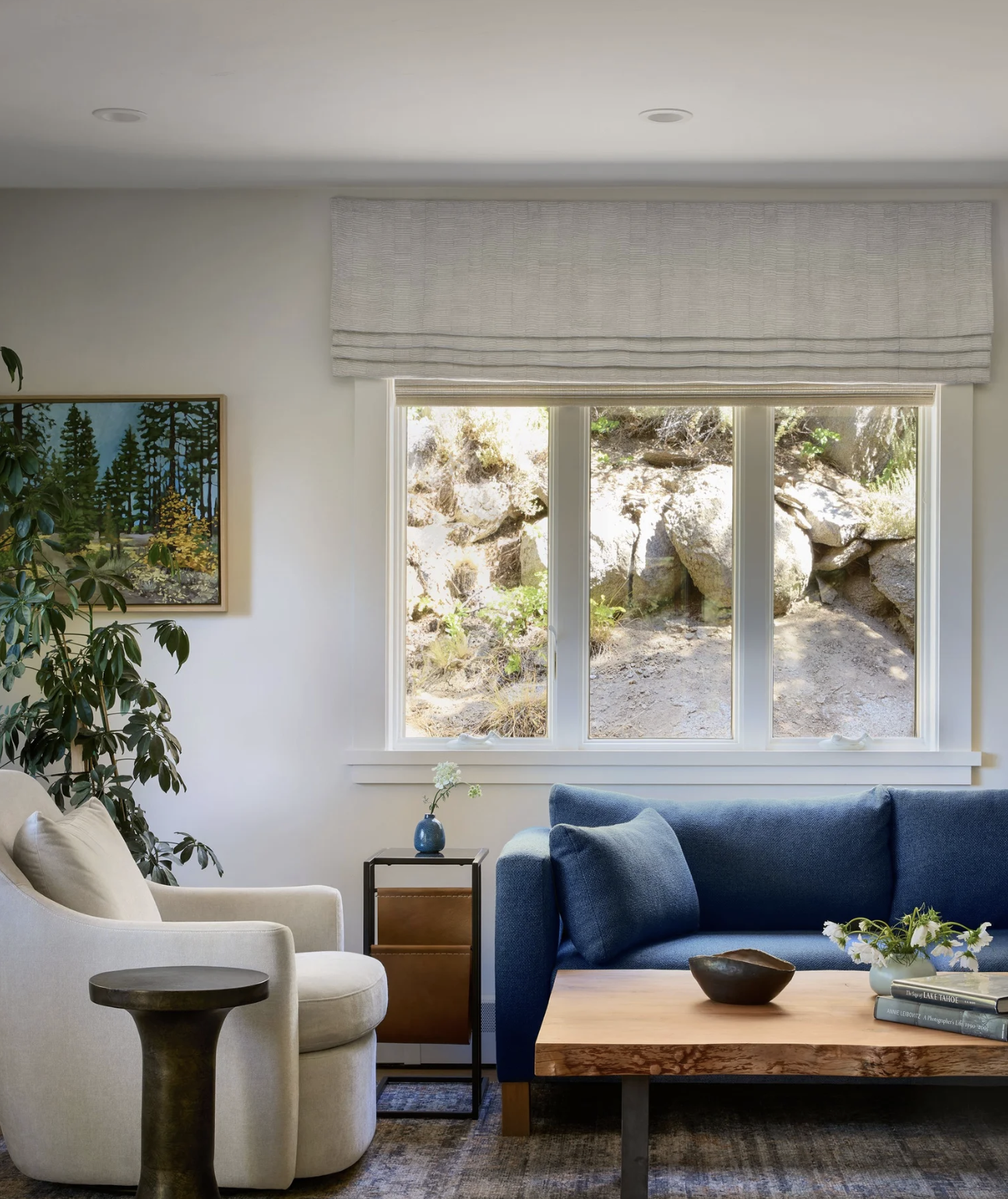
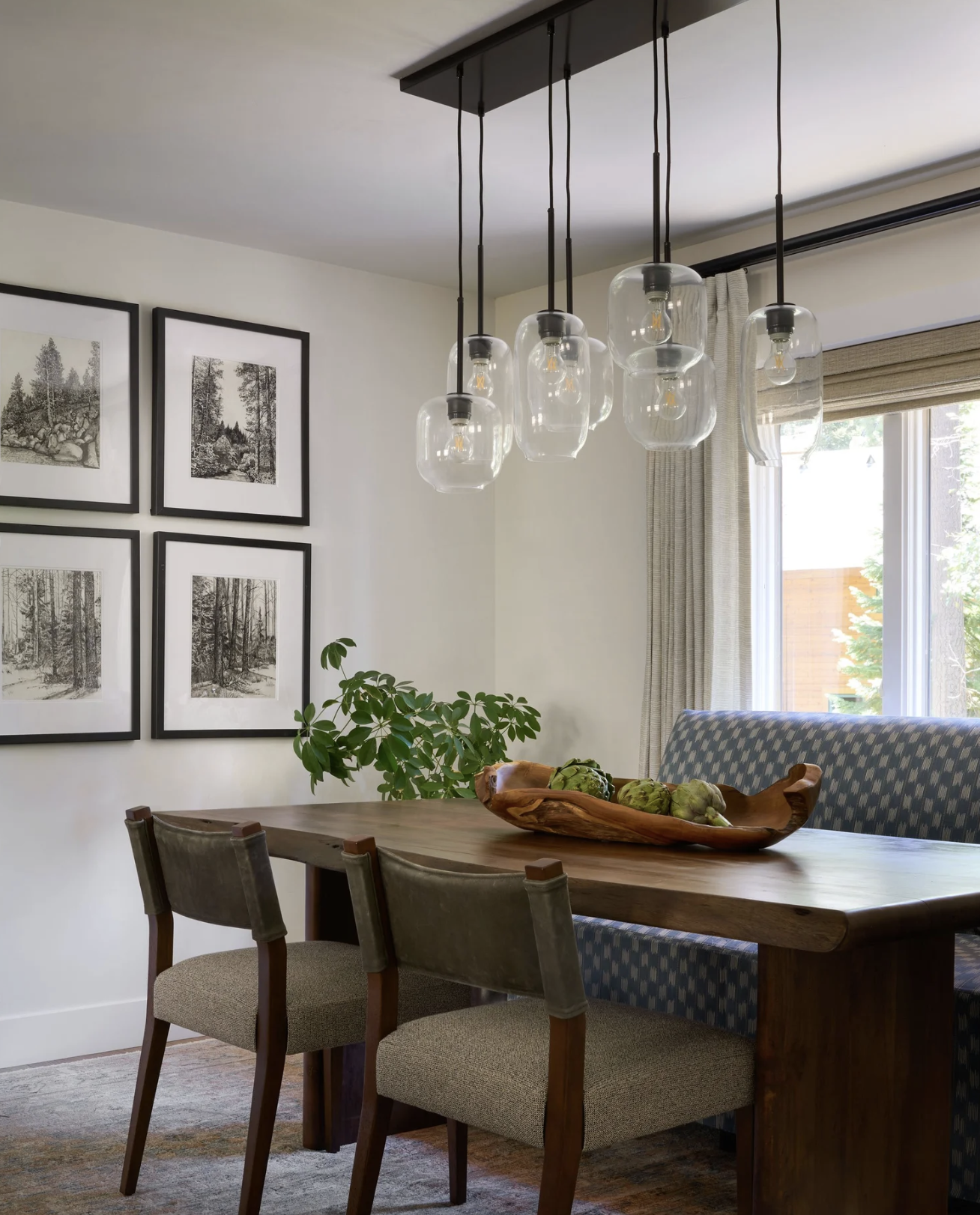
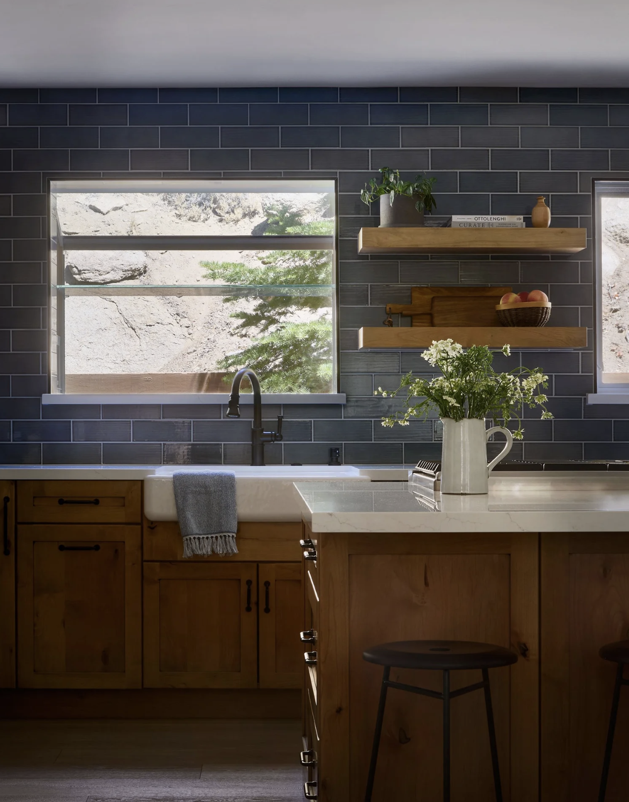
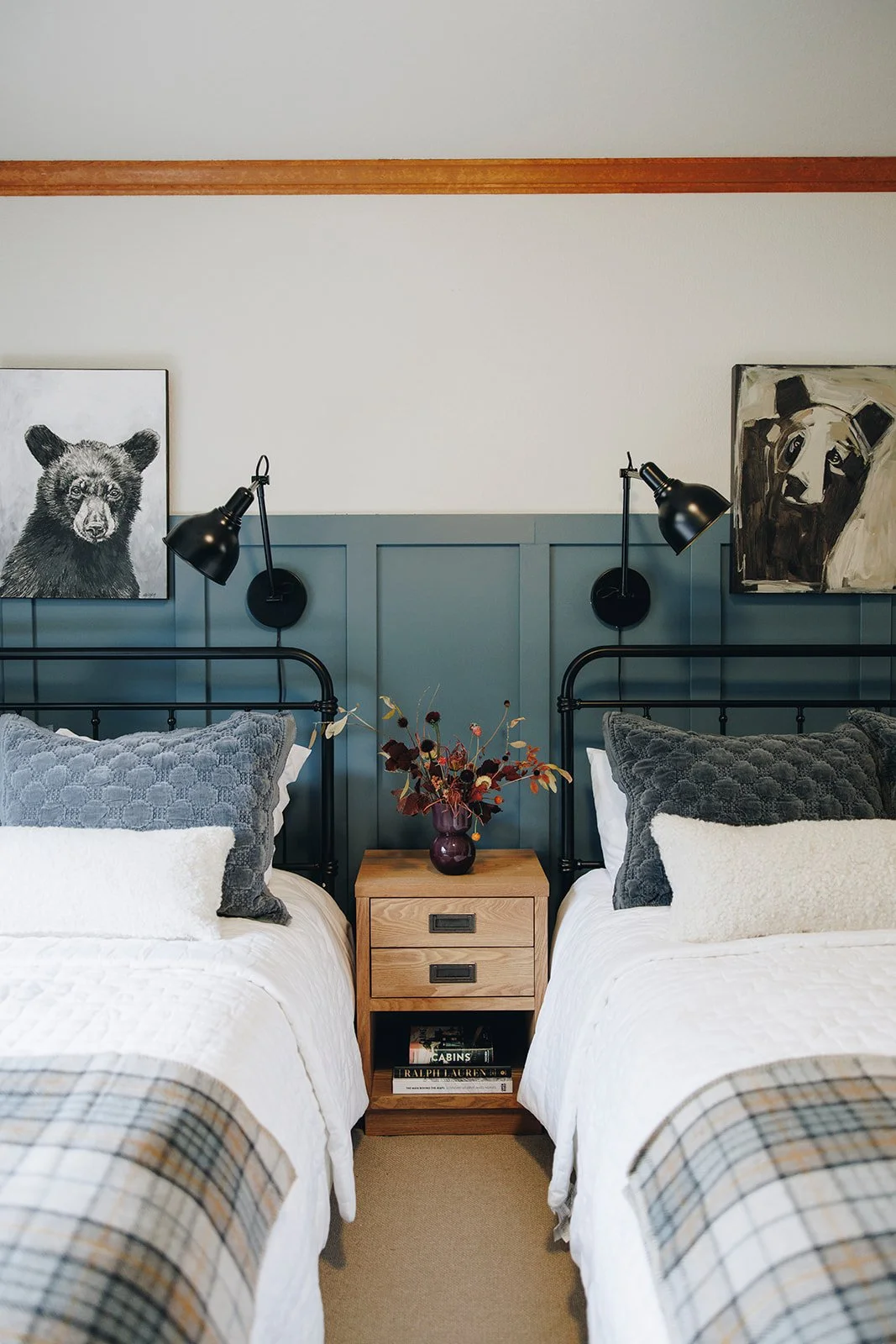
Photo credits: all above by Suzanna Scott