
NOTES
ON
COLOR
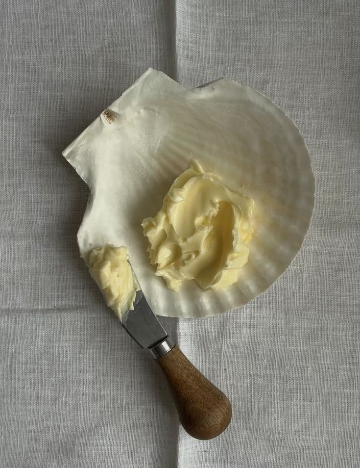
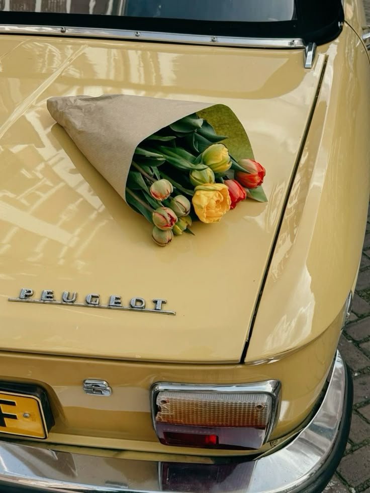
Photo credits: both Unknown via Pinterest
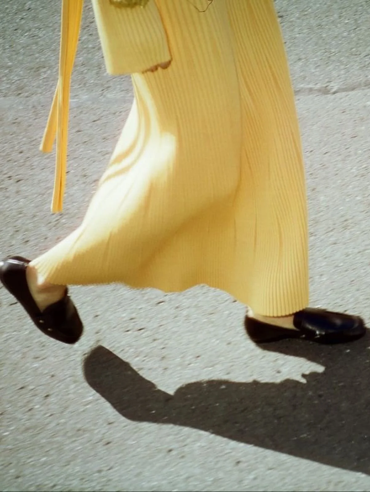
September's color of the month is BUTTER! This hue has been showing up in fashion and interiors for years and we think it is simply so chic and timeless. Softer than a stark white, it is flattering on everyone and in every context.
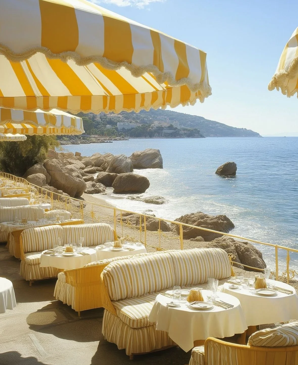
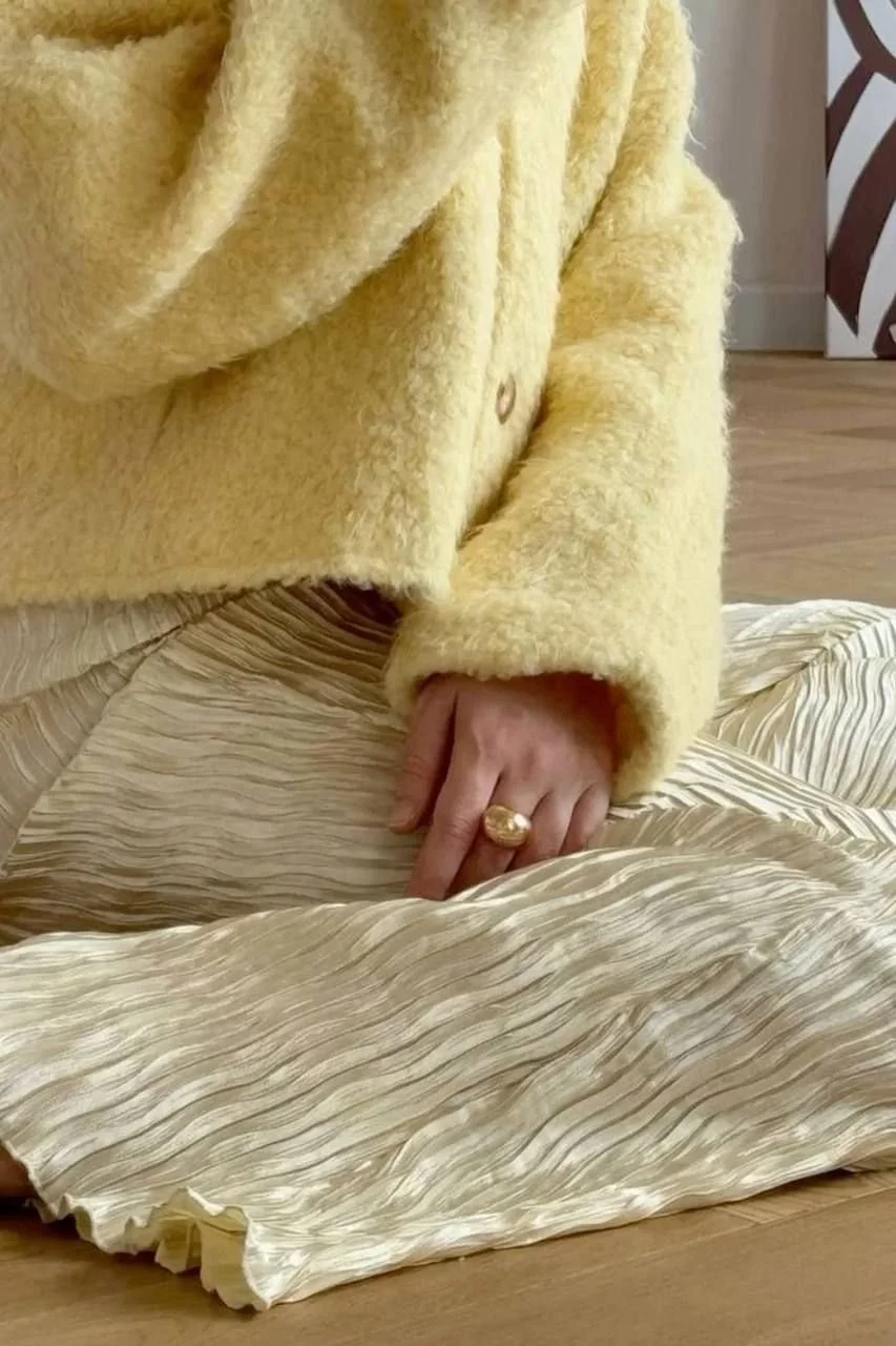

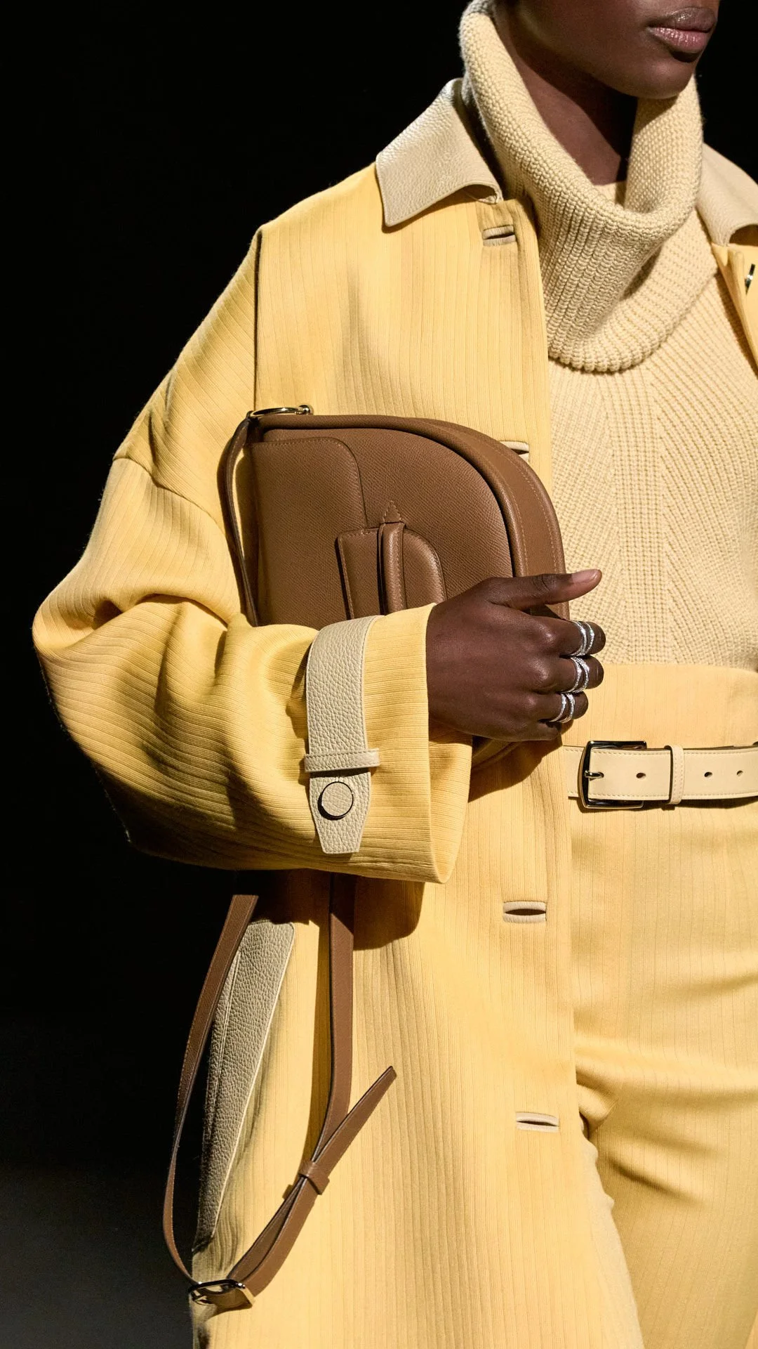
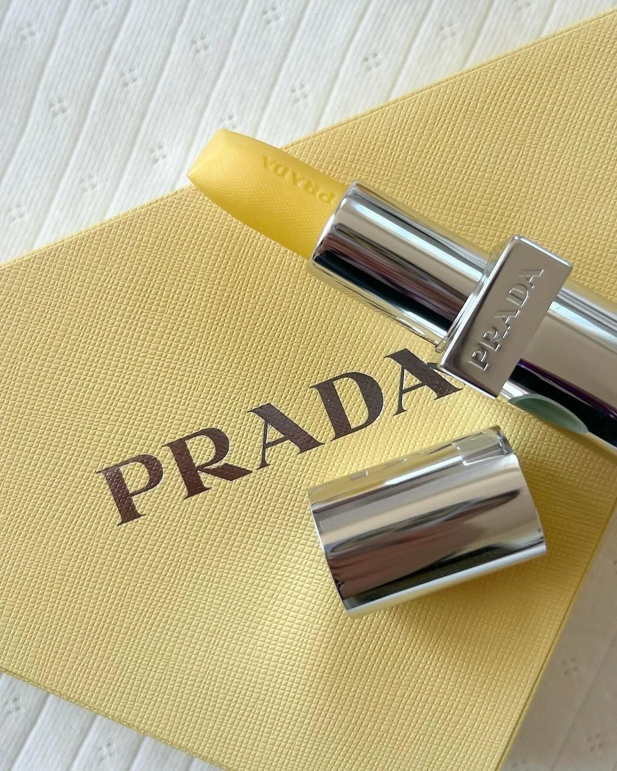
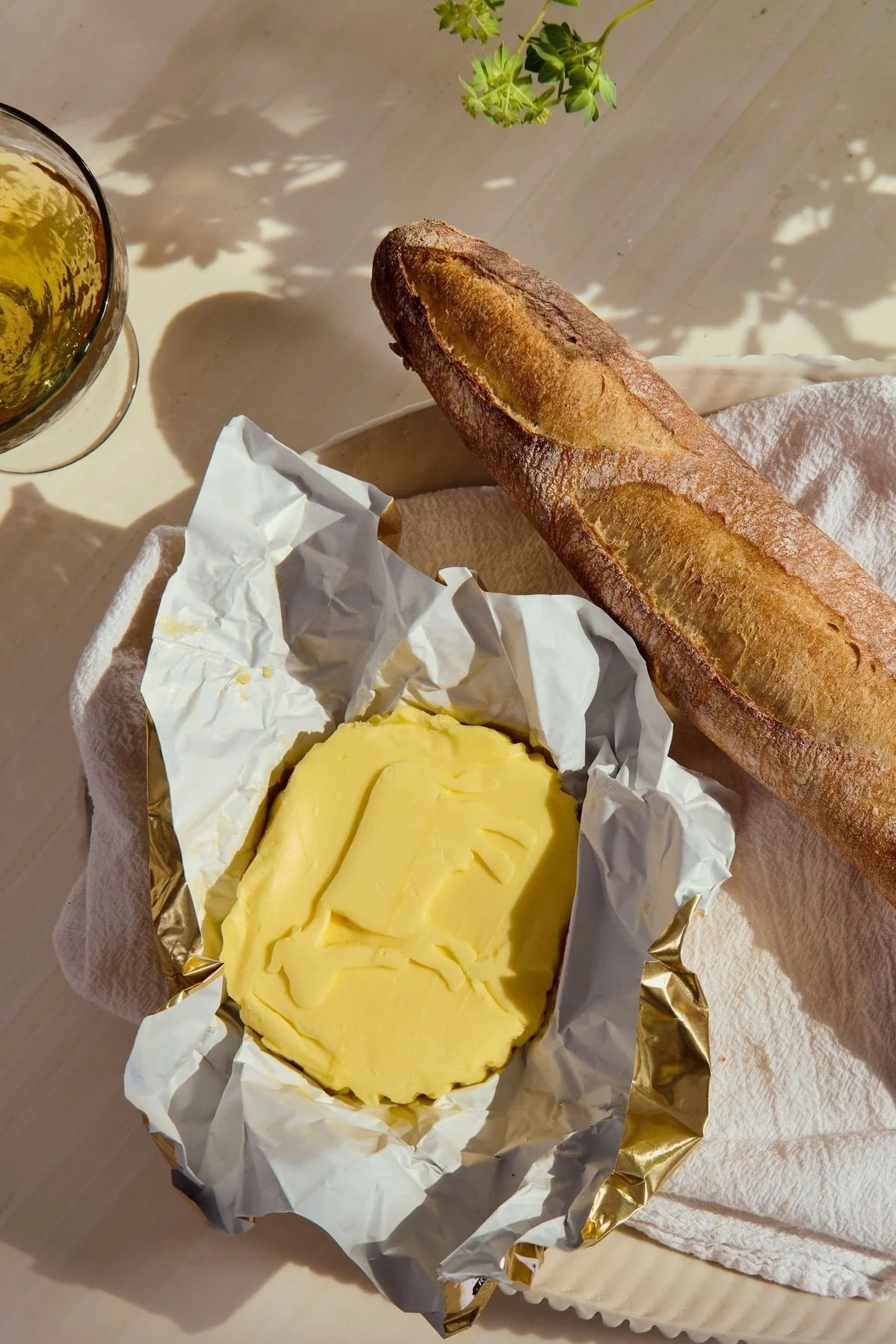
Photo credits, top row: all Unknown via Pinterest. Photo credits, bottom row, left to right: Hermès, Prada, Unknown via Pinterest
Butter in Interiors
The butter we love is less yellow than it is white with a warm tint. Butter walls would feel like they're set aglow in candlelight. Better than a boring white kitchen, we would LOVE to design a butter yellow kitchen, but the color is also lovely as an accent. Think butter yellow linens, cabinets, side tables, and more! You can use it anywhere in place of a super crisp white to give warmth and a timeless classic look.
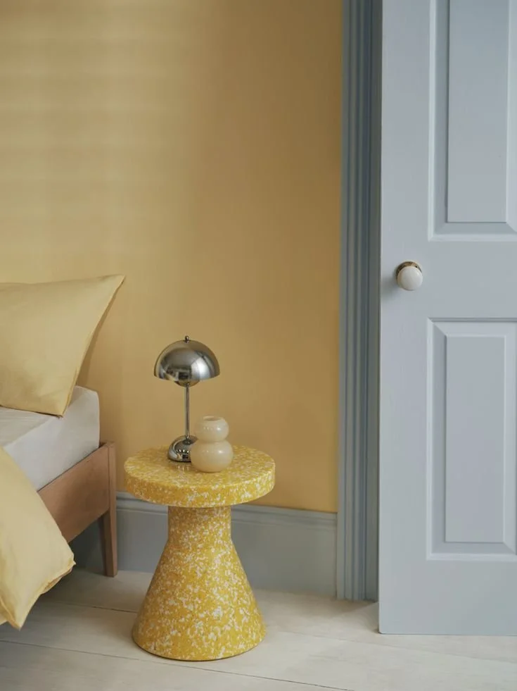
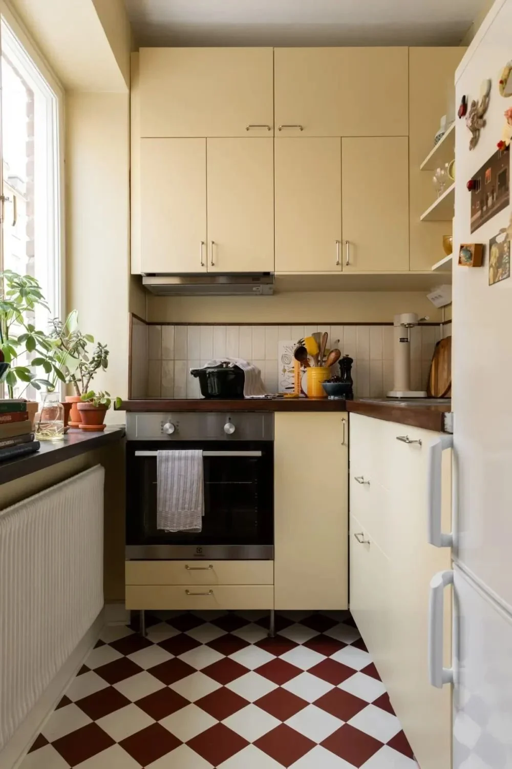
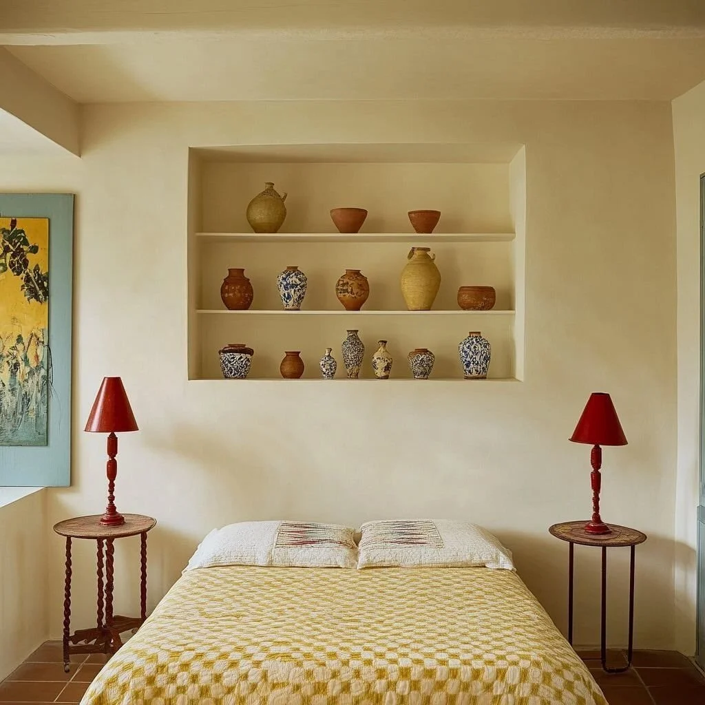
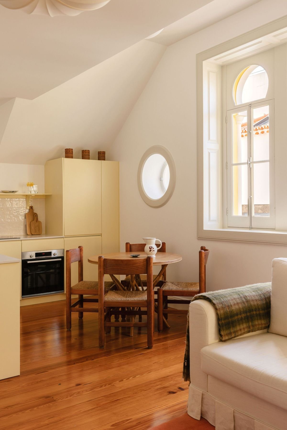
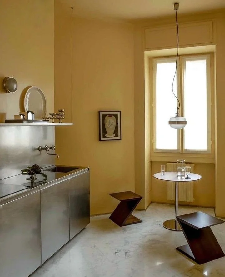
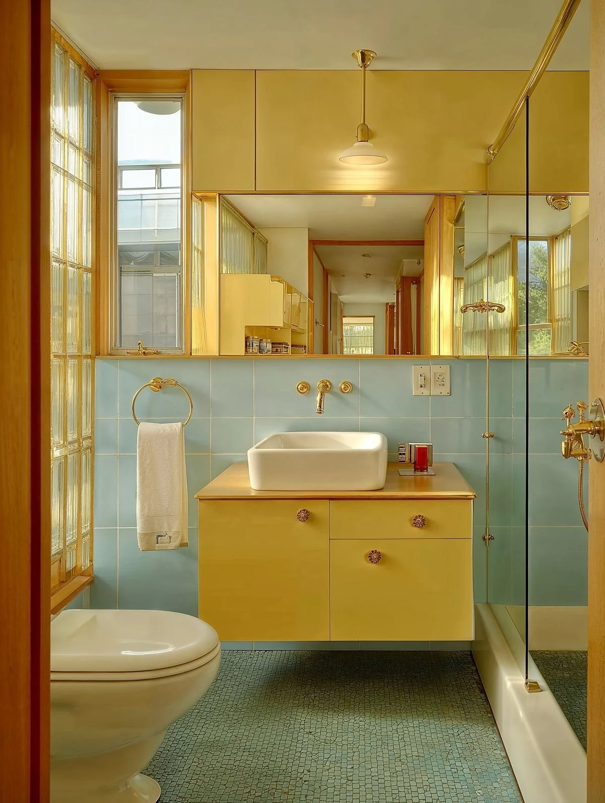
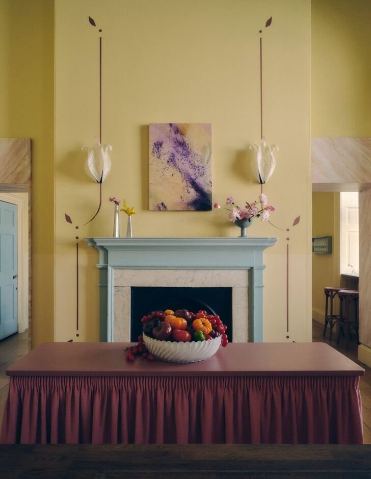
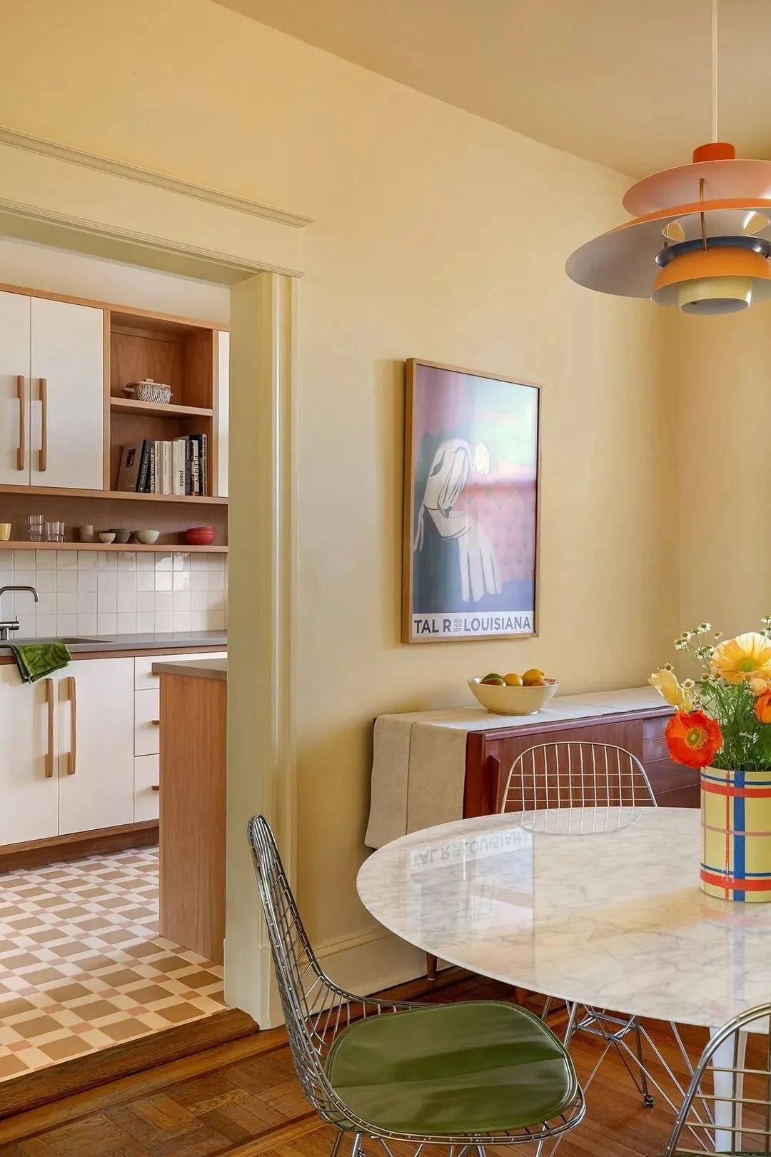
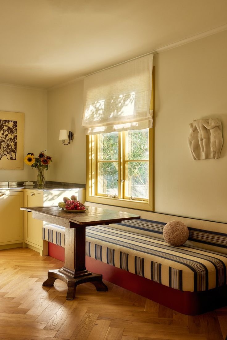
Photo credits, clockwise from top left: Normann Copenhagen, Nordroom, Unknown via Pinterest, Unknown via Pinterest, Julia Stridh, Strom Interior Studio, Café Petiole, Jacquelyn Scalamera, Christian Frascaro and Francesco Cristiano